Interactive Presentations
The Question I Couldn’t Answer From a Slide
The first time I presented the 12,000-message analysis to my client, I brought a summary deck. Clean charts, the three objection categories that mattered, my recommendations. Four slides in, the head of sales asked: “Is it the same story if you look at SMS only?” I didn’t know. The deck didn’t know. I said the six worst words in consulting—“I’ll get back to you on that”—and the meeting’s energy never recovered.
Next quarterly review, I brought the tool instead of the deck. Same analysis, but explorable: filter by channel, by objection category, by month. The head of sales asked her SMS question again, and this time she answered it herself—clicked the filter, watched the numbers rearrange, and then kept going. Instagram only. The competitor objection over time. The meeting ran 20 minutes over because they didn’t want to stop asking. I mostly stood there while my client convinced themselves of findings I’d have struggled to sell as bullet points.
That’s the difference in one sentence: a slide asks the audience to believe you. A slider lets them convince themselves.
Interactive presentations—where audiences explore rather than absorb—are a specific application of everything you’ve been building: the same weekend-sized tools, pointed at how you communicate instead of how you work.
Why Slides Hit a Ceiling
Static presentations put audiences in receiving mode. You present; they absorb. That’s fine for announcements. It fails for complex decisions, because the moment someone thinks “but what if our situation is different?”—and in every decision meeting, someone does—your slides can only show what you prepared. Every “what if” either gets a new deck next week or goes unanswered, and unanswered what-ifs harden into deferred decisions.
There’s also the simpler problem. Watch any audience 20 minutes into a slide deck—the phones come out. You’re fighting biology with bullets.
And there’s a cost most presenters never total up: the “I’ll get back to you” tax. Every question a deck can’t answer becomes a follow-up email, a revised deck, sometimes a whole second meeting. My SMS moment cost me two hours of rework and three weeks of decision delay—for a question the data could have answered in four seconds if the data had been in the room instead of flattened into charts about itself.
Interactivity fixes both at once: the “what if” gets answered in the room, with the asker’s own numbers, while the asking keeps everyone’s hands on the material instead of their phones.
When Interactivity Earns Its Build Time
Not every presentation deserves a build, and the gate is one you already know how to run.
Interactivity earns its keep in four situations, and they compound when they overlap.
The decision requires exploration. Complex choices benefit from seeing scenarios, not just your recommendation. If the room needs to understand what happens under three different assumptions before they’ll commit, showing them one path with conviction is less persuasive than letting them walk all three.
The audience’s numbers differ from your examples. An ROI model running their inputs beats your case study every time. Generic examples invite the “our situation is different” objection; their own numbers preempt it.
Buy-in matters as much as the decision. People support conclusions they helped reach. An audience that spent 10 minutes driving the model has skin in the answer—they can’t later claim the analysis was done to them.
The audience is small enough to engage. Interactivity needs hands on inputs. A working session of 4 to 12 people is the sweet spot; a 500-person keynote is a broadcast, and broadcasts want slides.
It doesn’t earn its keep for announcements, format-mandated compliance decks, or 5-minute updates. The overhead is real, and a simple deck that can’t crash is sometimes exactly the right technology.
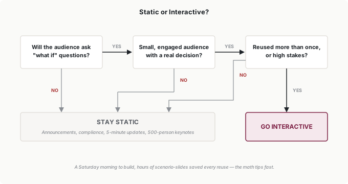
The investment math is the build-vs.-buy ledger from the last chapter with reuse doing the deciding. My first presentation calculator took a Saturday morning—call it 4 hours—and has saved a couple of hours of scenario-slide preparation every review since, which means it paid for itself inside a quarter. Budget the maintenance quarter like any other build, estimate double what seems reasonable (every build I’ve done has demanded it), and remember the matrix: a presentation tool is specific and low-scale—squarely in the build-it-yourself quadrant. Reusable plus high-stakes is the green light. One-time plus routine is the red one.
The Elements, and the One to Start With
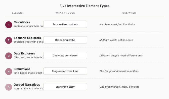
Start with a calculator. It’s the workhorse: buildable in an evening, demoable Monday, and it carries the whole persuasion mechanism. The audience inputs their own numbers—their customer count, their loss-rate assumption, their timeline—and watches the outputs move. When board members see projections built on their assumptions instead of yours, something important changes: they’re not your projections anymore—they’re theirs.
Here’s the worked example. Say you’re proposing a pricing change, and you know the room will ask “what if we went smaller?” and “what if we phased it?” You could build slides for every variation, or you could write this brief—it’s a SCOPE brief; the output format is a web page:
“I need a web page calculator for a pricing change analysis. Inputs: current price, proposed new price, customer count, estimated customer loss rate, implementation timeline in months. Outputs: revenue impact by quarter, break-even point. Display as a simple table with a chart showing revenue over time. If any input is zero or blank, show a message instead of breaking.”
That last constraint is a scar: my first calculator divided by zero in a dry run, and I’d rather you inherit the lesson than the experience. In the meeting, the choreography matters as much as the tool—introduce the question the room was going to ask anyway, hand over the input, and narrate what changes. You’re not presenting anymore; you’re hosting their exploration.
The other elements are second and third builds.
Scenario explorers show branching consequences—“if we choose Option A, here’s the path; Option B, here’s the alternative.” They’re right when multiple viable options genuinely exist and the room needs to trace implications before committing: restructuring decisions, resource allocation, anything where your recommendation is one defensible path among several. Rather than arguing for your branch, you let the audience walk each one and discover why yours holds up.
Data explorers let different people cut the same data their own way—filter, sort, zoom. My message-analysis tool is one: it replaced a deck’s worth of precomputed views with three filters, and it serves the head of sales and the operations lead simultaneously even though they never want the same view. Build one when your audience keeps asking for different slices of the same underlying data.
Simulations and guided narratives sit further out: time-based models that show how situations evolve, and choice-adaptive stories that reshape themselves around audience decisions. Both are genuinely powerful and genuinely more work—multi-weekend builds with real testing burdens. Get a calculator into a real meeting first. More isn’t better; better is better.
Building and Presenting It
The build loop is the one you already run—describe, generate, test, refine—and the V1 discipline applies unchanged: one element, 3 to 5 inputs, outputs you can define precisely, working completely before you add anything.
What’s new is that the audience is in the room when this tool runs, which changes the risk profile. A live demo is not Forgiving—so the verification moves up front. Test on the actual device you’ll present from, on the actual screen resolution; a layout that’s elegant on your laptop can be unreadable on a conference-room display. Feed it the edge cases: zeros, blanks, absurdly large numbers, because someone in the room will type one—usually the most senior someone, usually while everyone watches. Have a colleague drive it cold, without instructions; where they hesitate is where your labels are wrong, and their confusion is a cheaper lesson than your audience’s. And always, always have static screenshots as backup—technology fails, and your proposal shouldn’t fail with it.
One more presentation-specific habit: decide in advance which inputs you’ll offer to the room and which you’ll drive yourself. Handing over the keyboard is the persuasion move, but it works best on the one or two inputs the audience actually disputes. Let them own the assumption they doubt; you handle the navigation. Unstructured “play with it!” invitations stall meetings.
Trust works the way it always has: the tool debuts at Rung 1, in a low-stakes room. My message explorer ran in two internal reviews before it ever faced the client. By the time it mattered, I knew what every filter did under pressure.
Hosting is simpler than it sounds. A local HTML file opened in a browser needs no internet—conference-room WiFi has ruined better presentations than yours, and my message explorer has run off a laptop file since day one for exactly that reason. Free static hosting works when the audience should explore on their own devices, before or after the meeting. Anything with confidential numbers stays on internal infrastructure, full stop—an explorable tool is a data-exposure surface, and it deserves the same caution as any export. And these tools go on the same annual inventory as everything else you build, with the same date-stamped versions—the archaeology problem is identical.
Putting It Into Practice
Elena’s budget ask survives finance review
Elena’s headcount request had died in finance review two years running—solid slides, deferred decision. This year she brought a calculator: content output as a function of team size, with the input assumptions—pieces per writer, review time per piece—editable in the room. Finance did what finance does: challenged her assumptions. She handed them the keyboard. They lowered her productivity number, raised the ramp-up time, and watched the model still show the same conclusion: the bottleneck was headcount. The request cleared, not because the numbers changed, but because they’d stress-tested the numbers themselves.
The tool took her one evening, built on the same brief-template discipline her team already runs. She’s used it twice more since—quarterly planning and a reorganization discussion—which is the reuse math working exactly as the matrix predicts.
Jordan puts the slider in the memo
Jordan’s client memos always drew the same reply-thread: “what does this look like if margins compress?” Now the memo links to a one-page sensitivity view—two sliders, revenue growth and margin, chart updates live. Stakeholders answer their own variations before the meeting, and the meeting starts at the interesting question instead of the mechanical ones. Build time: one evening. It’s the same earnings data his script already pulls; the explorer is just a front end on work he’d already done—which is the quiet pattern of this whole part: each build makes the next one cheaper.
Tomás lets the lender drive
Tomás’s line-of-credit renewal used to mean a PDF of projections and three follow-up calls. This year he brought his banker an adjustable model: revenue assumptions, seasonal curve, draw schedule—all movable. The banker’s first move was to cut the growth assumption nearly in half, which would have felt adversarial on paper. Live, it was just a question—and the model’s answer, that the firm stayed comfortably inside covenants anyway, was the banker’s own discovery. The renewal took one meeting.
Ingrid writes the exposure rule
Ingrid’s contribution, as usual, is the sentence in the policy: any interactive tool shown outside the department carries only data already approved for that audience, and anything shared externally—a link a client or board member can open—goes on the tool inventory with a named owner. An explorable tool is a data-exposure decision wearing a presentation costume; a filterable dashboard can reveal cuts of the data nobody reviewed. Her rule makes that decision deliberate. Inside those lines, her teams present interactively without asking permission—which was the point.
Common Objections
“My audience expects traditional presentations.”
Some do—which is why the tool debuts at Rung 1, in a friendly room, embedded in an otherwise normal deck. One calculator answering one live question is how expectations change. Mine changed a client’s meeting culture in exactly one quarterly review.
“I don’t have time to build something interactive.”
Count the time you already spend preparing scenario variations and fielding “what if” follow-ups after the meeting. My Saturday-morning calculator repaid itself in one review cycle, and it wasn’t close. If the presentation recurs, the build is usually the time-saving option.
“What if it breaks during my presentation?”
Assume it will, and it mostly won’t. Static backup slides, a dry run on the presenting device, edge-case inputs tested in advance. When something breaks anyway, say so plainly and switch to the backup—a prepared presenter with a failed demo loses 2 minutes; an unprepared one loses the room.
“I’m not technical enough to build these.”
You’ve already built tools with exactly these skills—this is the same describe-generate-test loop pointed at a new output. The calculator brief above is a SCOPE brief. If you’ve done the work of this part of the book, the only new skill in this chapter is stage management.
Your Monday Morning Action Item
Find the “what if” question in your next important presentation—the one the audience always asks, the one that spawns follow-up meetings.
Write the one-paragraph description of the tool that would answer it live: inputs, outputs, and the constraint that keeps it from breaking on stage. Run the gate: will the audience ask what-ifs, is the room small and the decision real, will you reuse the tool or are the stakes high? Three yeses: build it this week, V1 rules, and debut it somewhere low-stakes. Any no: keep the idea and keep your slides.
Either way, watch your next few meetings with new eyes. Count the questions that die on “I’ll get back to you.” Each one of those questions is a build candidate waiting for a Saturday morning—and after a while you’ll notice the pattern I did: the questions repeat, meeting after meeting, because they’re the questions that always mattered. The deck just never let anyone ask them properly.
There’s a longer arc here worth noticing as this part of the book closes. The intern started by drafting messages you reviewed word by word. Then it built tools only you touched. Now its work stands in front of a room, taking questions from people who will never know an AI helped build it—promoted, rung by rung, all the way from supervised draft to the thing your audience holds in their own hands.
The next thing you build won’t be for you.